


If your website gets traffic but no leads, it’s kinda like throwing a party where the only people who show up weren’t people you actually invited…
To make sure this doesn’t happen anymore, we are going to look at how clearly your website explains your offer, addresses buyer objections, builds trust, and guides someone toward the next step. Each part of the website experience can make it easier (or harder) for the right person you meant to invite to reach out – and we want to make sure it is as easy as possible for your people to say “Yes”!
Because right now, people are visiting your website. Your inbox, however, has apparently decided to take a little vacation and the most enthusiastic person in your emails is a random person with a cold pitch for a service you’re not even sure you need…
It is frustrating when you have website traffic but no leads, especially when you know the quality of your work and how much you have put into your business. You want someone to land on your site, recognize that you can help, and feel confident taking the next step. But right now, they are bouncing – literally.
That is why strategy matters for your website – far beyond just a pretty design. The order of your sections, the information you share, and the way you guide people through your pages all deserve a reason behind them.
At CP Creative, that thinking goes into every design, from the templates we create to the sites we build for clients. Each is strategically structured to guide the user experience and improve the opportunity for relevant visitors to become leads. Your words, photos, and offer bring that structure to life.
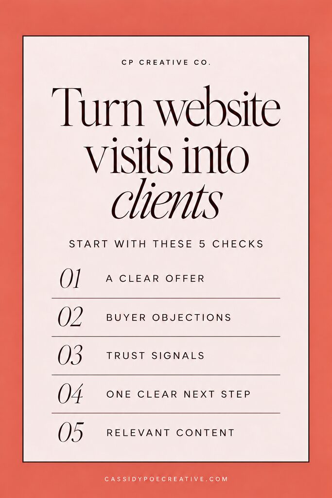
And I’m going to give you a little peek inside our brain at 5 places to look when your website is getting attention, but your inbox is still crickets.
1. Can a new visitor understand what you do?
When someone has website traffic but no leads, this is one of the first things that I look at. So, I want you to do a small exercise with me. Open your homepage and read the first section from the lens of someone who has never heard about yoour business. Can they tell what you offer, who it is for, and how it could transform their life?
Here is an example:
A headline like “Make room for more” might feel beautifully aligned with your personality and vision for your clients. But on its own, it leaves your visitor doing quite a bit of guessing when they have never heard of you. Make room for more…what? More money, more time, more tacos, more dessert?
For an imaginary business coach for photographers, a clearer direction could be:
“Helping you grow your photography income without spending more hours behind the camera or endless editing in Photoshop”
Now your visitor has something specific to connect with. You can bring your personality into the rest of that opening section, too.
Try this: Write one sentence naming your service, the person it helps, and the outcome you help her work toward. Use it to check whether your opening line of copy communicates those same essentials.
Then ask someone unfamiliar with your business to read that section and describe what you do. If her answer is fuzzy, you have a useful place to begin editing.
You could also add your website into ChatGPT and ask it to view your site from the perspective of a cold lead and ask it if your offer, audience, and transformation are clear.
2. Does your services page address buyer objections?
Someone can love your work and still hesitate to inquire. She may be wondering whether the investment makes sense, whether she has enough time, or whether the service fits her particular situation.
Your services page can help her work through those hesitations before she reaches for the contact button.
Think about the concerns that come up before people hire you. Then give each one a clear, honest answer where it belongs on the page. Some examples could be:
- “Is this right for my business?” Explain who the service is for, what situation it helps with, and when another option might fit better.
- “What am I actually paying for?” Describe the deliverables, scope, and value of the work. Share pricing or a useful starting investment when appropriate.
- “Will this become another project on my plate?” Explain the process, what you need from the client, and which responsibilities you handle.
- “What happens if I need help?” Clarify the support and revision process included in your actual offer.
For example, a consultant could explain what happens during the engagement, what the client receives, what the cost would be if they didn’t take action, and what preparation is expected. A photographer could address how she helps clients prepare and feel more comfortable during a session (while capturing important moments that will be memorialized for a lifetime).
Try this: List three reasons a well-matched client might hesitate. Check whether your services page answers each one with specific information. An FAQ can help, but some answers belong beside the price, process, or service details themselves.
Related: The Secret To Writing Copy That Converts Naturally (Without Feeling Salesy)
3. Have you given her a reason to trust you?
Before someone hands over their money, time, or business, they need a reason to feel comfortable choosing you. Buying something is always a trust-exchange.
Trust signals help your ideal client assess who you are, how you work, and whether your service fits what they need. There are several ways to build that confidence:
- Relevant testimonials. Choose feedback that speaks to the service on the page. Specific details about the experience can be more helpful than a standalone “She is amazing!”
- Work samples with context. Explain what the client needed, your role, and the work you delivered. A short description gives a portfolio image or project sample more meaning.
- A clear process. Show what happens after someone inquires, how the project unfolds, and what she needs to do along the way.
- The person behind the business. Include a current photo, an accessible about page, and a clear explanation of your approach so visitors can get to know you.
- Relevant credentials or experience. Share qualifications, training, or professional affiliations when they genuinely help someone evaluate your service.
- Accurate, consistent details. Current service information, working links, and clear contact details help the website feel cared for and make it easier to use.
Try this: Place one relevant piece of proof beside the claim it supports. A testimonial about your thoughtful guidance belongs near your process. A project example belongs near the service that produced it.
If you are early in business, you can explain your process and show clearly labeled sample work. Use real testimonials with permission, and describe outcomes accurately. Trust grows from giving people useful reasons to believe what you say.
4. Is the next step clear, focused, and working?
Take a look at the actions your page asks someone to take. Book a call, read the blog, join the newsletter, follow you on Instagram, download a guide… all in the same section?
That is a lot of decisions for someone who may have only just met you.
A confused visitor can find it easier to put the decision off. Choose one primary action for each page and make it clear which step matters most. On a services page, that may be submitting an inquiry or booking a consultation.
You can repeat that same action at useful points as the page answers her concerns. Repeating a relevant invitation gives her another opportunity to act; introducing a different destination every time makes the path harder to follow.
Secondary options can still have a place. Give them less visual emphasis so they support the page instead of competing with its main purpose.
Try this: Review your main buttons. Do they guide people toward the same next step, and do the labels clearly explain what will happen when they click? “Book a call” sets a clearer expectation than “Let’s make magic.” You can bring the warmth and personality into the sentence beside it or around it instead.
Then follow the entire process on your phone. Tap the button, complete the form, and make sure the inquiry reaches the right place. Check that the confirmation explains what happens next, and remove form fields you do not need at this stage.
5. Is your content attracting people who could hire you?
Once your website gives visitors a clear path, consider how they are finding their way there. The topics you share can attract very different kinds of readers.
Imagine you are a photographer who wants more family sessions. A post about how to become a photographer may appeal to other photographers. A post about choosing outfits for a family session is more closely connected to the experience your potential client is planning. This could even help alleviate some anxiety your target audience may be feeling about choosing their outfits – which also builds trust 😉
Both topics can be useful, but they serve different people and drive very different actions on your site. The photographer will read, be inspired, and then leave because you don’t have an offer meant for them.
The new mom planning her family’s first photo session who feels guided and informed will be able to envision their matching outfits out on the beach at sunset and book your service feeling ready and excited about the photos she will have to put on her Christmas cards this year.
Try this: Review your recent blog posts, social captions, and Pinterest links. Ask, “Would someone considering my service look for this?” You can do this without opening an analytics dashboard.
If most of your content teaches other professionals how to do your job, add topics that help potential clients choose, prepare for, or understand your service. A consultant could explain how to prepare for a strategy session. A copywriter could explain what to gather before a website copy project.
Make sure the linked page continues that conversation, too. A post about brand photography should lead readers toward relevant session information and examples.
You are giving the right people a useful reason to visit and a relevant next step once they arrive.
Related: What Getting My First Hate Email Taught Me About Business
Give your visitors a clearer path to becoming clients
In the same vein as above, a website has several jobs to do before someone reaches out. It needs to help her understand your offer, see herself in it, feel confident in your work, and know how to move forward.
At CP Creative, those decisions shape both our Showit templates and the websites we build for clients. The structure is intentional: Offer, audience, clear action, transformation.
If you are ready for professional help bringing that experience together, explore our Website in 14 Days. It is our semi-custom Showit design experience for service providers who want a beautiful and strategic website that is tailored to their brand, audience, and goals.
You have put care into the business you are building. Your website should help people see that care and feel ready to take the next step.
P.S. Don’t forget to Pin this for Later <3

Grab the guide
Whether you're refreshing your current website or planning a brand-new one, this free checklist will help you uncover the copy gaps that could be costing you inquiries—and show you how to create a website that connects, builds trust, and converts.
The Ultimate Copy Boosting Checklist
the free guide!
Copy boosting checklist

